We all have heard this phrase, right?
“ How could you not love______? It’s a classic”
The phrase that is used to describe basically anything with the highest quality over a lengthy period. But how well do these things, and in our case jerseys, hold up to this standard? Opinions can change from day to day, but we are going to take a look at a couple “classic” jersey and see if the team’s most famous jerseys are designed well.
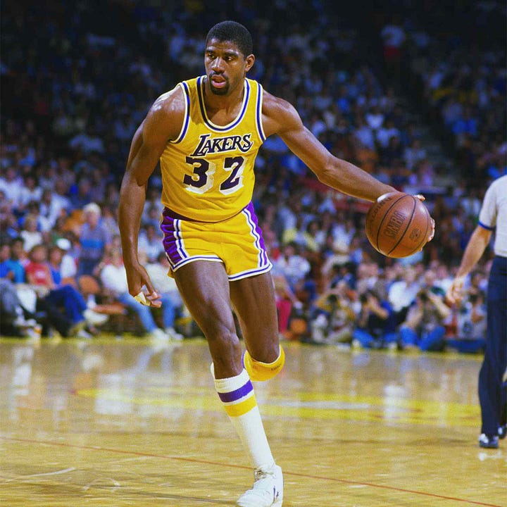
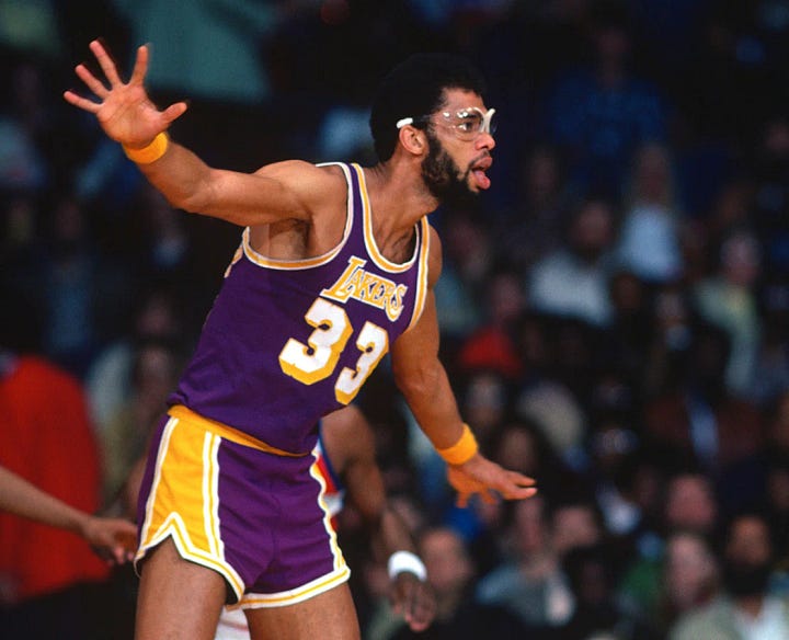
For our first jersey, we are going to look at the Los Angeles Lakers most identifiable Jersey. You know, the Showtime Lakers? Magic, Kareem, Worthy to name a few? The Purple and gold is one of the most recognizable teams in the world.


First off, let’s look at the colors. Purple and Gold are the colors that sit on opposite sides of the color wheel. Purple, being a deep, cool color that is “loud” (meaning in your face) enough to stand out when you use a lot of it. Gold/Yellow on the other hand provides a nice warm color to contrast with the deepness of the purple, creating a solid foundation for the Lakers brand. Using a lot of yellow can sometimes hurt you when not attempted correctly, though. The Lakers also have a splash of white for striping and small details to the jersey as well. The colors are good. They provide great contrast and are in your face enough to recognize them. However, looking at the jerseys above, the “drop block” on the numbers is not something I’m in love with. This is mostly on the yellow jersey, seeing that the white on top of the yellow is putting two colors doesn’t provide enough contrast. This is a slightly less problem on the purple jersey because the purple provides a pleasant background to help differentiate between the top number and the background drop block.
Next we will look at the logotype. For those who don’t know what I’m talking about, it’s the word “Lakers” across the chest. Instead of calling words and letters logos, we call it “Logotype” just to differentiate it a little better.
The Lakers font is a nice serif block font that is thick enough to be seen from far away, but elegant enough to have a little more personality than Times New Roman. It has some small custom serifs that give the lettering a creative push. The lettering for the numbers, however, create some disconnect from the pleasing main typography. I think that would really unite the entire jersey together.
Don’t get me wrong, I really LOVE this jersey. I own a yellow Kobe Jersey. I truly feel this jersey has great design elements in it, but could use some minor tweaks to make it great.
What do you all think? Is this good design? Or Bad Design?
- Jackson
I know we all hate seeing this but if you do like this content please consider subscribing for when I post! It’s totally free and just allows me to enjoy topics like this with you! Thank you in advance!


